Air Transformed

This is the first in a series of guest posts from the Life of Breath project team to accompany the current RCP exhibition Catch your breath curated in partnership between the RCP and Life of Breath.


When putting together this exhibition, time and again we stumbled up against the challenge of how to represent breath and air, things which are both invisible and transient. Some of the most striking objects in the exhibition are trying to do just this – make breath, air, or in the case of ‘Air Transformed’, air pollution, visible, tangible and three dimensional.

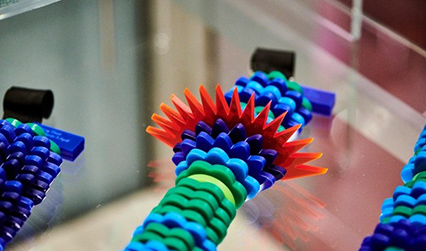
‘Air Transformed’ is a series of wearable objects which represent air pollution data from Sheffield in 2014. Commissioned by Better With Data, the artist Stefanie Posavec and data journalist Miriam Quick collaborated to create these striking glasses and necklaces. They took openly available air quality data and, focusing on three of the most problematic pollutants nitrogen dioxide, small and large particulates, collated the results into daily averages.

Photograph of three pairs of glasses made of transparent green material, with different symbols etched onto the surfaces of the lenses.
‘Seeing Air’ by Stefanie Posavec and Miriam Quick (2015).

The glasses are made up of three layers, where each layer represents a different pollutant and the larger the pattern the higher the pollutant levels. So the ‘cloudier’ the glasses appear, the worse the air quality that day. There are three pairs representing a relatively clean day, a day with high nitrogen dioxide and, in the centre above, a day with high particulates.

By contrast, the necklaces use only the levels of PM10 particulates in the air. PM10 particulates (<10 micrometres) are invisible to our eyes and are typically produced by burning fuels. They irritate the airways aggravating conditions like asthma or COPD and long term exposure may cause lung cancer.

Photograph of a necklace displayed on a glass shelf. The necklace is made from half-discs of plastic of different shapes and colours. Some are smooth and green, some are curved and blue, and one is spiky and red.
‘Touching Air’ by Stefanie Posavec and Miriam Quick (2015).

Each necklace represents a week’s worth of data, with each segment the averaged data for 6 hours. The size and colour of the segments indicates the PM10 levels – small, smooth and green means good air quality, whilst large, spiky and dark blue or red means high particulate levels and very poor air quality. Can you spot Bonfire night?

Although striking, the necklaces are not delicate. They weigh heavily on the chest, just as the burden of air pollution weighs heavily on us all. Does seeing data represented this way make you think differently about the invisible dangers of air pollution?

Sarah McLusky, Life of Breath Project Manager


On Thursday 2 May data journalist Miriam Quick is talking about the creative processes behind the two artworks displayed in Catch Your Breath at our Museum Late. Miriam’s talk is at 6.45pm, with other drop-in activities throughout the evening until 8pm. Free entrance. Book online for the evening, or pop-in on the day.

The exhibition Catch your breath is open free of charge 9am–5pm, Monday–Friday until 20 September 2019.

Date
by
Katie Birkwood ,
Rare books and special collections librarian

Read our weekly library, archive and museum blog to learn more about the RCP’s collections, and follow us on Twitter, Instagram and Facebook.


Library, Archive and Museum